LOOPUYT & CO. DISTILLERS
CORPORATE IDENTITY
LOGO, LABELS, PACKAGING,
POSTERS, PROMOTIONAL MATERIAL, FILM DIRECTION …
WEBSITE FOR DESKTOP/MOBILE DEVICES WITH SELF-HOSTED VIDEO INTEGRATION
BESPOKE TYPEFACE: LOOPUYT
SCHIEDAM, ROTTERDAM, THE NETHERLANDS
2014 – 2024
Based in the ‘gin city’ of Schiedam, the Netherlands, the birth place of Gin (jenever), Pieter Loopuyt founded Loopuyt & Co. Distillers in 1772.₁ The re-establishment of the company from 2014 called-for a tremendous body of graphic output from D. G. M, and until date, a moral discretion of voluntarily in-house realisation had been reserved.
Owner Jan van Stigt Thans and master distiller Jaco de Leyn, with the ‘ontwerp’ of D. G. M, revived the solution back into the limelight, which proves success as one of the forerunning gin beverages of the Netherlands, available from leading distribution outlets, supermarkets, venues, bars incl. speakeasys, resturants and museums.
Once a bank, the grand headquarters at Lange Nieuwstraat 101 has remained office since 1772 and houses a cocktail bar, an ice cellar, a barbershop and boxing ring.
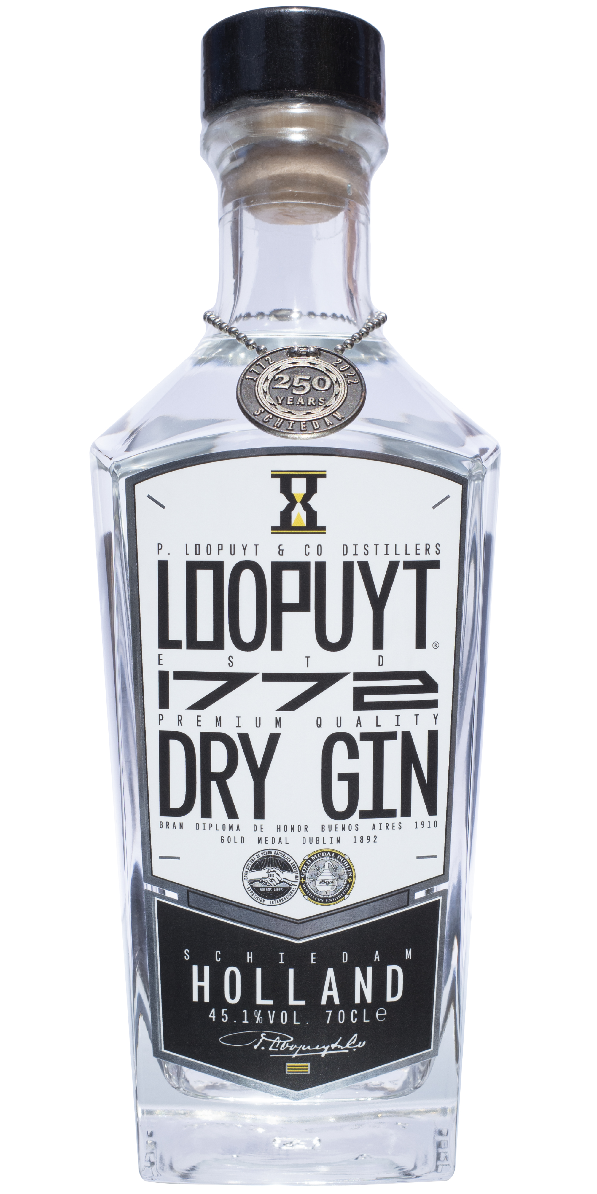
Based on the original recipe estd. 1772, Loopuyt Dry Gin is of exquisite taste. A fusion of twelve independently distilled herbs and spices make the vapourisation process finer than average gins.
Vincent van Gogh painted a bottle of Loopuyt gin during his career, H. M. Queen Beatrix of the Netherlands enjoys a Loopuyt G&T and general director Taco Dibbits of the Rijksmuseum in Amsterdam, has voiced attraction towards the label etiquitte.₂ Loopuyt Mini Dry Gin was available on Eurostar and the company is also the official drinks sponsor for The International Film Festival, Rotterdam.

The Loopuyt bespoke typeface (2014 D. G. M.) underwent refinement by incorporating the Monylop Principle. The optismall version has clear definition for typesetting at small sizes, hence gaping ink/light-traps – a somewhat squarish metamorphic suction, reminisent of nineteen-nineties cyber-fluid gabba lettering. Van Stigt Thans requested a ‘modern classic’ vision.
It was after visiting typographer Walter Nikkels, at Dordrecht Quay which lead D. G. M. towards the typeface initiation.₃ Hand painted signs around the harbour influenced a monochrome approach. The label lettering is narrow in order to maximise the Y-axis of the logotype. The L is chopped to mirror the T and the square O and P rebel against classified norms in order to fortify branding.
Nationalities other than Dutch often find pronouncing Loopuyt somewhat challenging. Therefore 1772 plays a connotative role in identification and articulation. The ratio of the numerals is ninety degrees rotation thereof the lettering, yet preserving the vertical strokes, broader than horizonal for optical legibility.

In collaboration with printers Autojon Netherlands, D. G. M. conducted the innovative technique of digitally printing the label with white ink print on a reflective surface. A method of printing which diminishes high costs of traditional foil pressing and offset lithography. To further the development of this techinque, tests were made in order to protect the print via an additional topcoat layer.
An effect of trickery whence viewing the label from behind and within the bottle challenges the concept of branding, it becomes invisible. D. G. M. updated his label in 2023 to incorporate historical medals, double-black print for further density and all type set to the Monylop Principle.
The shape of the label refers to the shields in Schiedam city’s coat of armour.₄ The black and yellow flag of Schiedam is situated on the label, above the ghost of the bottle.
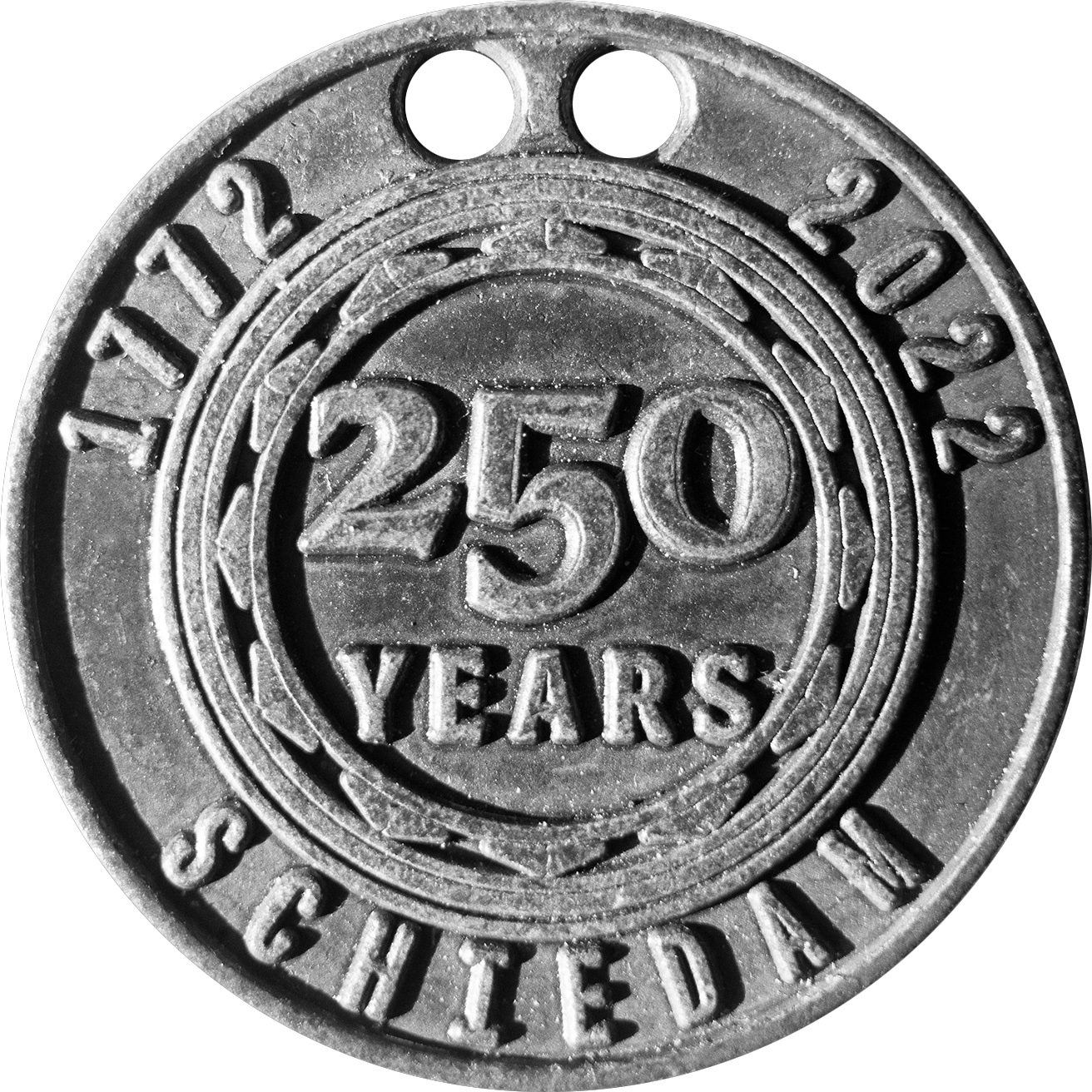
To celebrate 250 years of Loopuyt (1772–2022), D. G. M. took into account all requirements to work with CNC metal engraving, in multitude. The typographics for the cast finds references to coinage of a mid-twentith century taste for clear-cut proportion and golden sectioning. An exclusive serif type was drawn by D. G. M. for the celebratory coin and declared appropriate for the digital inscription.

Within the shields of Schiedam sit hourglasses and for Loopuyt gin, the hourglass mark represents a ‘long drink’. D. G. M. reinterpreted the hourglasses into a single emblem, which rotates when pouring. The entire label now shines as the original heral-dry gin.
Loopuyt and Co Distillers won Gold medal at the Distillers Exhibition in Dublin, Ireland in 1892. In 1910 the company won Grand Diploma of Honour at the International Exhibition in the Repubic of Argentina, Buenos Aries.
D. G. M. extracted key graphic elements from the original awards, reinterpreting them into vector defined medallions as an addition to Loopuyt’s legacy and illustrated upon the label. A custom version of the bespoke Loopuyt typeface was appointed for the perpendicularly shaped Buenos Aries medal lettering. The Dublin gold medal incorporates the D. G. M. typeface Caesura.₅ Both medals garnish Loopuyt’s heritage.

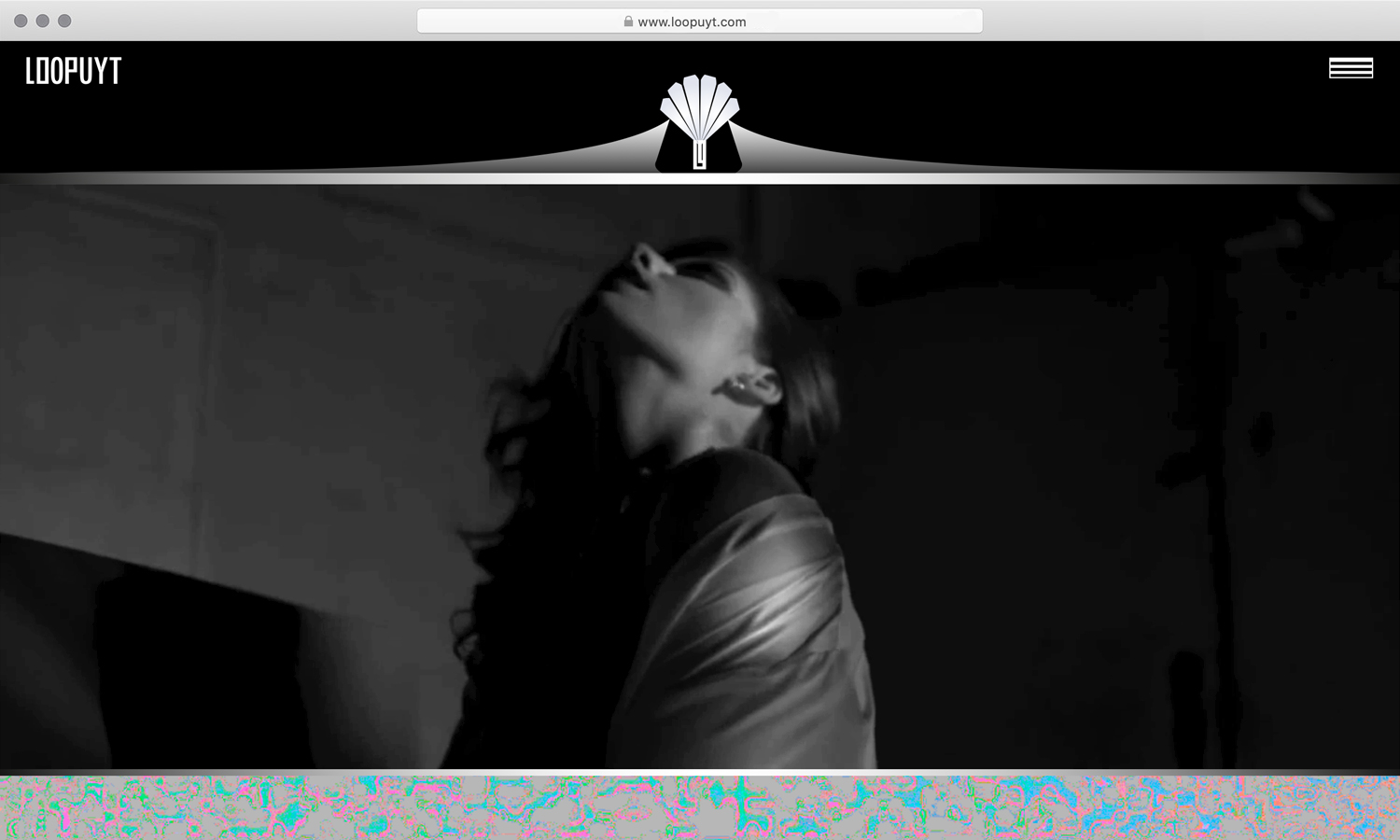
100% freedom was given to establish the entire design and arrangment of the website, of which is built entirely from scratch by D. G. M, cross-device stable and incorporates unique illustrations and graphics. The main body-text typeface is set in Monylop.
₁ G. Moore, bottle collector and friend of D. G. M. in England, dug-up an unbroken green bottle of Loopuyt Gin at the harbour of Old Portsmouth. Both were born in Portsmouth. Research shows that Loopuyt Gin was exported from Schiedam and imported into Portsmouth for its sailors, see archived label [fig].
₂
See Still Life With Clogs And Pots, 1884 by Vincent van Gogh.
Excavations by Kees Rovers at a carpenter’s workshop in Nuenen, the Netherlands, reveal shards with Loopuyt embossed clearly upon their surface. Van Gogh had frames and easels built for him at the workshop, where today Kees Rovers offers artist-in-residence opportunities, a blossoming studio setting for international artists, graffiti writters in particular. Also a temporary place-of-residence of van Gogh. Between 1853–90 Loopuyt was the most dominant Jeneva available, mass produced with wide circulation.
₃ Jos Deuss (art restorer) introduced D. G. M. to Walter Nikkels in 2014, Dordrecht. D. G. M. was impressed with his wall of typographic books, fine wine and kind advice. Both were dressed in grey. It was the first time that D. G. M. had experienced gentlemanly encouragement, apropos to typography.
W. Nikkels is known for his designed art, notably his long-term triumph in applied typography for Stedelijk Muesum SMA, Amsterdam. He abides to the term ‘concrete art’, a movement initiated by Theo van Doesburg in 1930.
During the corporate identity remodelling for Loopuyt, D. G. M. was invited to slumber a night at the house of van Doesburg in Meudon, on the outskirts of Paris. He enjoyed the occasion and ambience of the location, while studying the spiral rotation of the dual-cubic architecture. The house was realised in 1939 and is composed out of two interlocking cubes.
Further reading: Walter Nikkels: Typography - Depicted | Abgebildet | Afgebeeld, (Valiz & Tropen, 2013). And, Theo van Doesburg: Grundbegriffe der neuen gestaltenden Kunst, by Theo van Doesburg, (Neue BauhausBücher, 1966).
₄ Pieter Loopuyt was mayor of Schiedam and the coat of arms sits recessed above the entrance of town hall.
₅ Both the D. G. M. monogram and Diagram Editions™ logotype are set in Caesura. D. G. M. established the seriffed typeface Caesura in 2019, Brussels, Belgium.
https://www.loopuyt.com
Monylop Principle →